Photoshop collage experiments
Collage One – Idea one
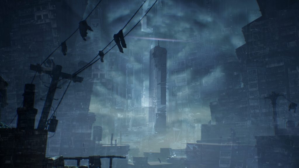
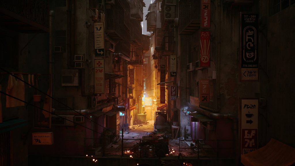
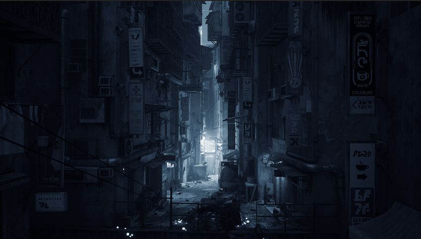
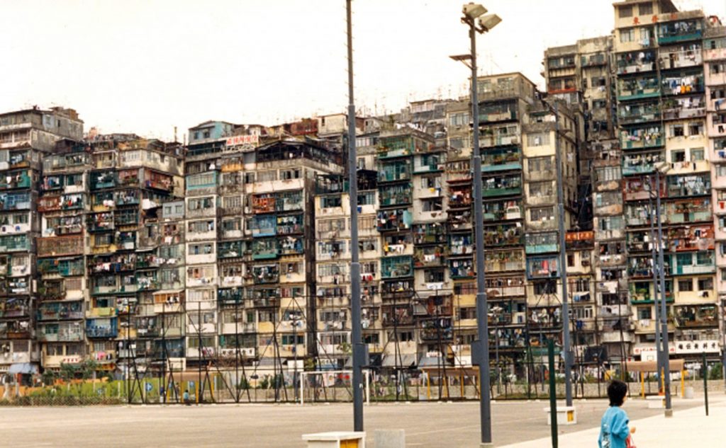
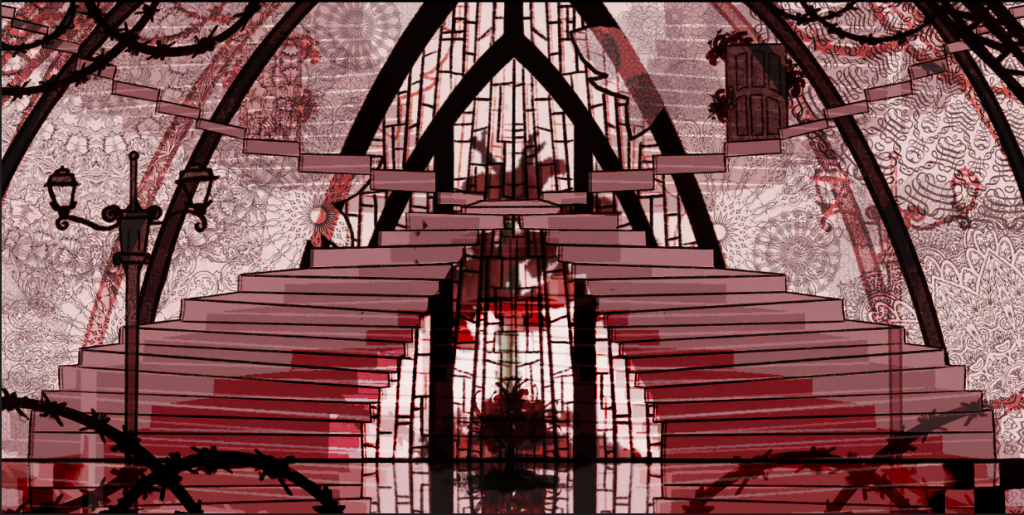
Post-apocalyptic city inspired by Kowloon city, mixture of cyberpunk and dystopia . Inspired by stray and Honkai star rail (boulder town) and Little Nightmares. Would also lean into forgotten utopia concept.
Making this collage
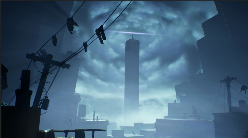
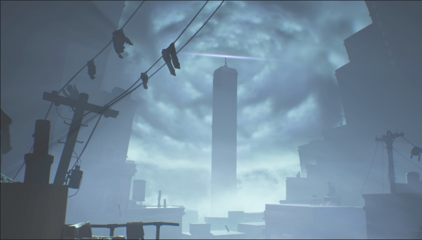
First, I used an image of one of my game inspirations as my background for this prompt; I chose “stray” because I was intrigued by how the illustrator directs the viewer’s gaze into the focal point of the scene by lighting it up and contrasting it with the rest of the scene. Furthermore, the dark elements worked well as a base, allowing me to layer more elements on top and have them stand out more. I used Photoshop to change the hue of the scene from orange to blue because I wanted to depict a cold and uninviting environment, which is what I imagined when living in a densely packed environment like this.
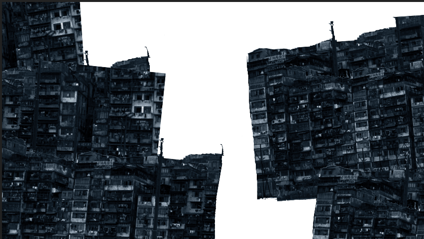
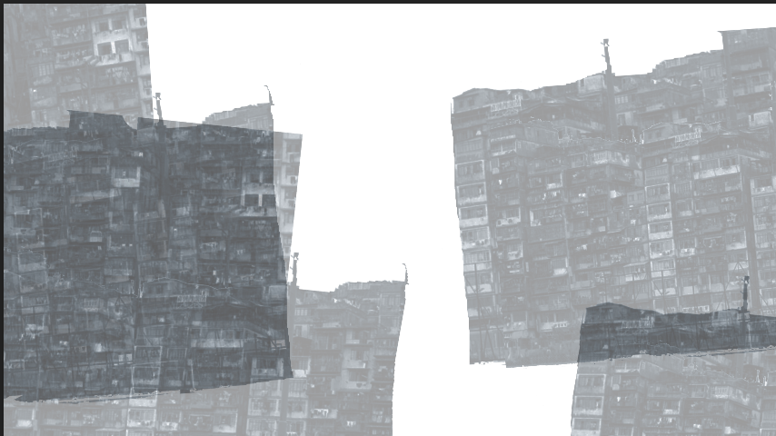
For the next step, I wanted to include actual images of Kowloon City, which is not only based on but also inspired by the prompt idea that I had. So I uploaded a photo of Kowloon City and adjusted the contrast, brightness, and desaturation to make it fit better in the collage. I then applied a blue hue filter to the image to make it match the colour of the background and blend in better. To make the scene composition more interesting, I experimented with duplicating the image, lasso tooling it, and cutting it into pieces that I rearranged with the rotate and transform tool to create a Frankenstein-like structure. This was to reflect my vision of Kowloon City as an overwhelming, monster-like megastructure.
Finally, I included another scene from a game that reminded me of a post-apocalyptic urban hell: Little Nightmare’s pale city, depicted ominously through a monochromatic colour palette. I was also inspired by how colour was used to effectively create an eerie desolate environment, which I wanted to include in my mood board collage, so I added this image and reduced the opacity to a faint overlay to add more ghostly imagery to the overall scene and heighten the eeriness. I also like how the main structure in the image complements the overall composition of this moodboard, drawing the viewer’s attention to the center.
Collage Two – Idea two
Technological dreamscape, making a future where nature, magic and technology mixes. Would be inspired by Ghibli and it takes two and the Solarpunk aesthetic. Would also lean into mystical realms.


Making this collage
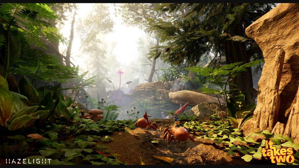
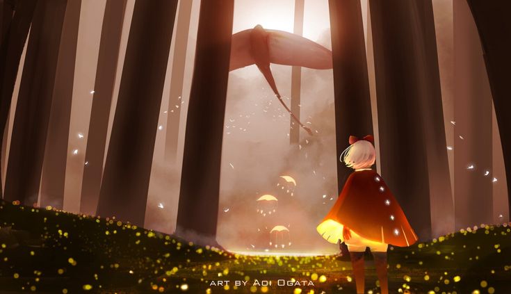
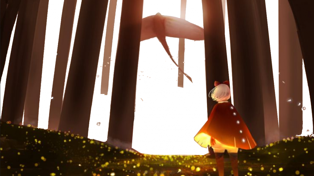
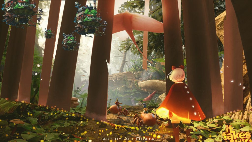
For this collage I wanted to try a different concept to add a variety to my idea choices. In this second prompt I aimed to make a collage based on my vision for a Technological Dreamscape, I thought about how many futuristic utopias incorporate nature alongside technology which inspired my moodboard collage. I looked at games that incorporate more of a magical element to the technological dreamscape to tie the idea to more of a naturalistic fantasy vibe. My inspiration for the background was the game “it takes two” as the game environment ties nature, magic and technology very nicely in the game play. I chose this image specifically because I liked how the composition makes us look upward emphasizing the contrast of size between the natural elements and the characters in the image.
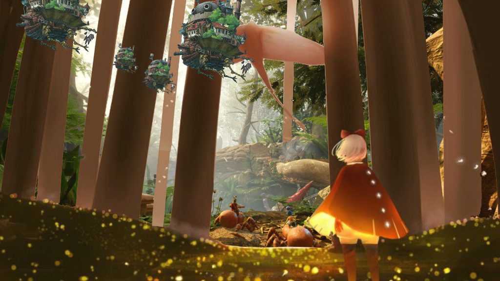
The next image I layered over the background was a scene from Sky Children of the Light. The game makes extensive use of warm colour palettes and monochromatic colours to create a more warm and comforting atmosphere, which contrasts with my other prompt. I specifically chose this game because the scenes depict nature in a very simplistic style, which contrasts with the rest of the image’s more detailed aspects. To incorporate the image, I had to experiment with a few Photoshop tools due to the increased complexity of cutting out specific areas of the image. The reason it was difficult was that there was little colour contrast in the background and I wanted to keep some of the light in the image. I used the magic tool to get the main simple shapes and the polygon lasso tool for areas which no selection was picking up.
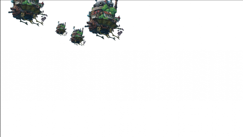
I then filled in the awkwardly positioned extra background areas with portions of the image itself, and I adjusted the opacity level to make the layer blend better into the background. I then included images of the castle from Howl’s Moving Castle because I wanted my scene assets to be inspired by such fantastical technological advancement, and this was the perfect example. Lastly, I added a yellow overlay by turning down the opacity of the colour to make the colours blend better with each other instead of standing out.
Collage three – Idea three
Forgotten utopia , recreating my own vision of khaenriah, an unknown location in Genshin impact. Inspired Nordic/Germany architecture. Would also lean into post apocalyptic concept.
Making this collage
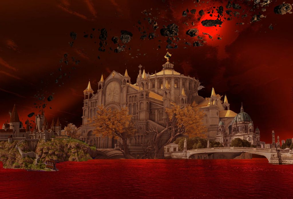
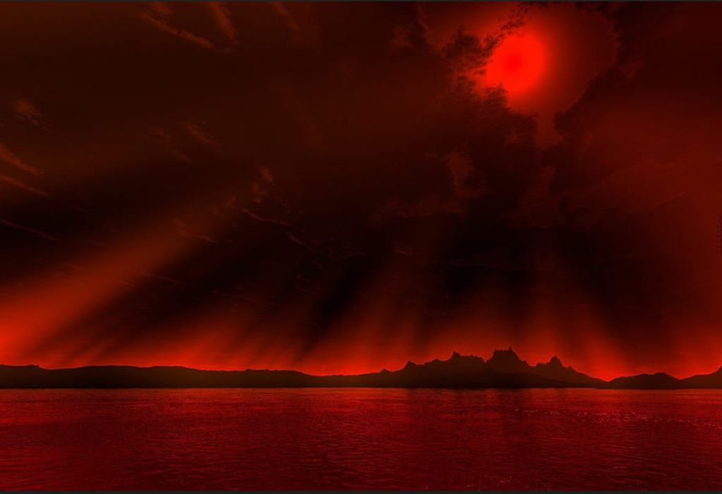
In this collage, I decided to create a scene inspired by an existing environment in a game that I was unfamiliar with, in order to create my own version of that space. I thought this idea was a more unique approach than my previous two concept ideas, which were based on creating my own concept from scratch. I used a red sky wallpaper as my background because I couldn’t find one that was clear enough for a game environment. However, the foreground consisted of three buildings, each from a different media.
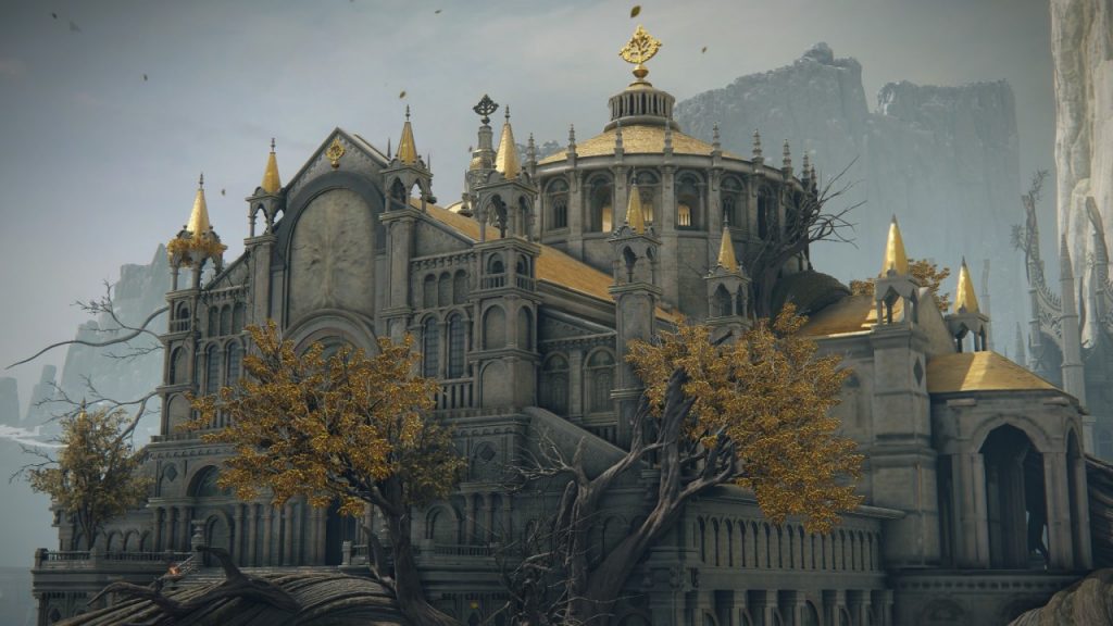
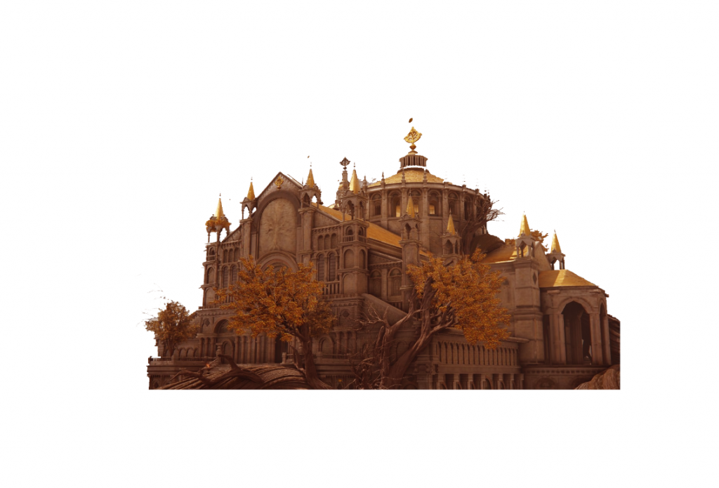
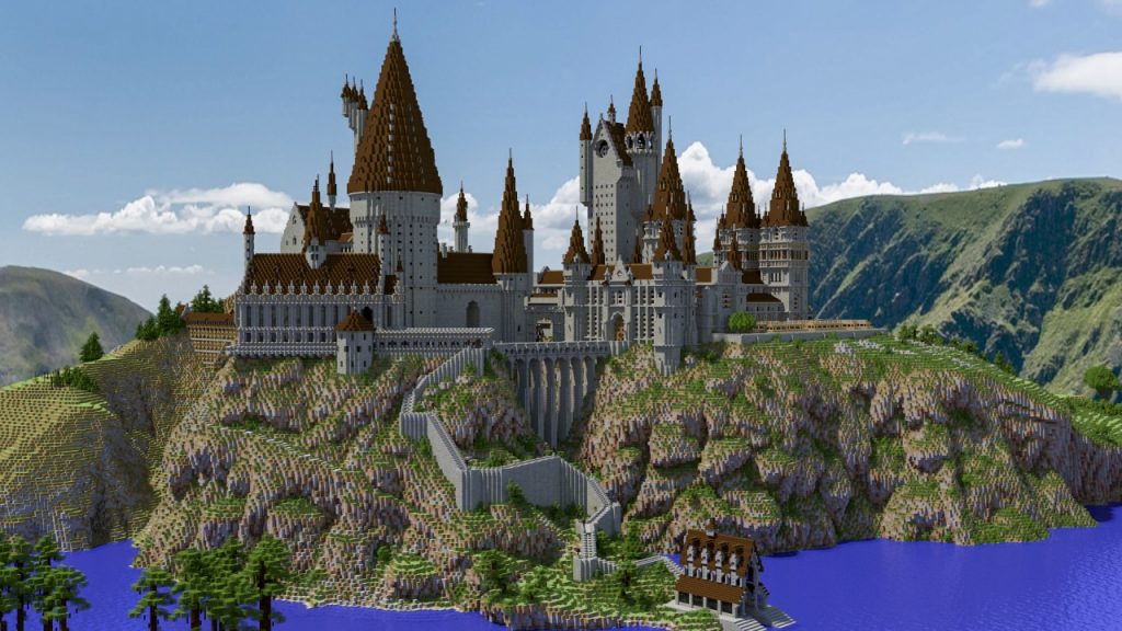
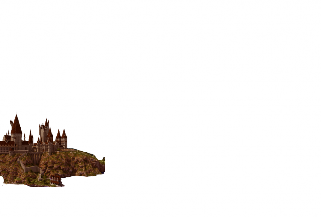
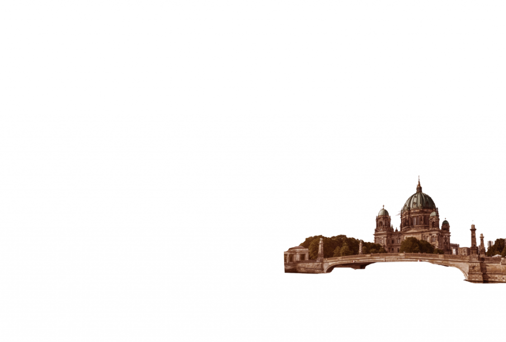
I used a building from the games Elden Rings and Minecraft because, unlike the other concepts, I wanted the buildings to be detailed and realistic, which these games provided. Despite the art difference, I was able to make the images blend in with the background by adjusting the contrast, brightness, and adding a red hue saturation to each image. In addition, I included German architecture to draw inspiration from the area where Khaenriah was based. I thought the building looked like a single megastructure because of my Photoshop manipulation skills. Finally, I added a meteor to symbolise the area’s calamity as well as the theme of forgotten utopia. However, if I were to improve on this idea, I would look at more ruined architecture as well.
Artist Research
Favelizacao by Ross Damien Janeiro
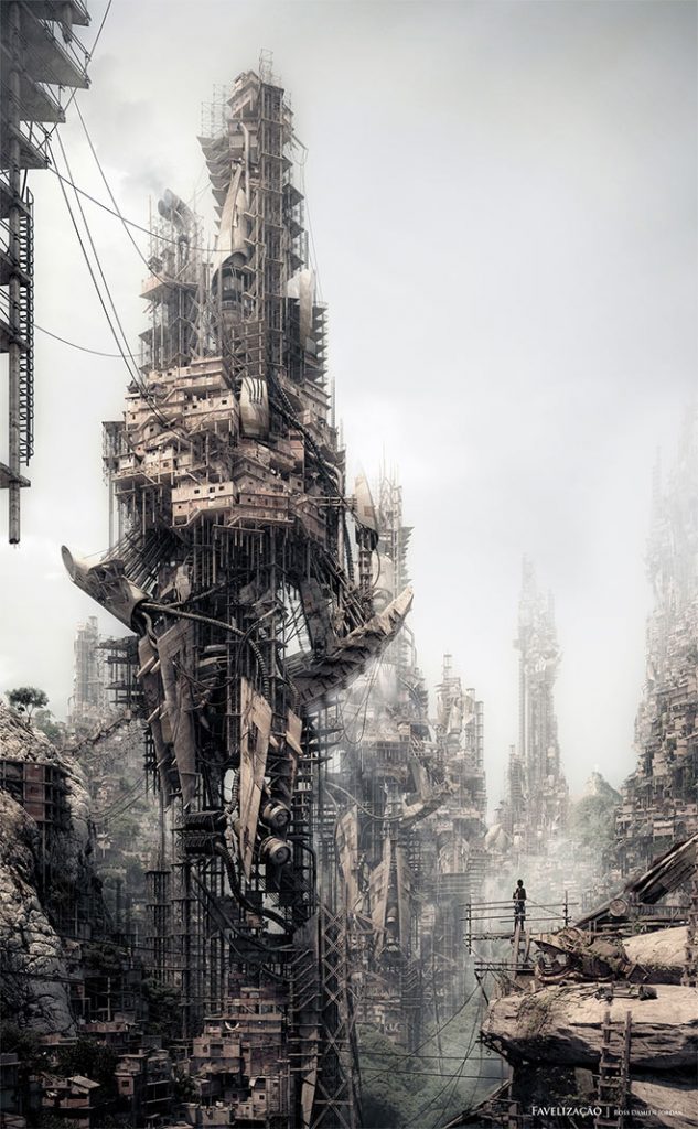
I appreciate how Janeiro incorporated shapes in his composition; the usage of triangles here provides a power dynamic in contrast to the diminutive figure to the right of the image. The premise that triangles are the strongest foundation contrasts with the unstable pieces that make up this building, which appears to be a collection of garbage arranged to form this sculpture-like structure. The building’s composition is noteworthy since the rule of thirds places the main structure as the focus point; however, we can only appreciate the sheer magnitude by comparing the person to the building. Lastly, the colour palette is very earthy and muted which contrasts the man m-made like structures taking up most of the negative space, maybe the viewer can infer that these buildings are an eco-friendly way to reuse junk to rebuild the structures in the environment.
Although there isn’t much going on in the illustration and only a few things are clearly apparent, the way the concept art is depicted reveals a narrative. This artwork inspired my project primarily because of the juxtaposition of the foreground and backdrop, the use of compositional method, and the general technical quality of the drawing.
Neon City by Vladimir Manyuhin
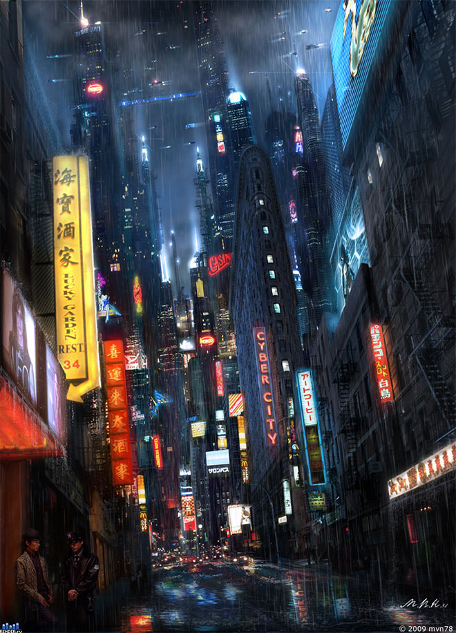
Vladimir Manyuhin uses neon signs in his artwork and the vibrant hues he chooses to use draw your eye in. By using a slanted low-angle lens and signage that gives the impression of a spiral towards the towers at the back, he skilfully directs the viewer’s attention around the scene towards the skyscrapers. I like how the artist also adds a rainy effect; it nearly gives the scene a dystopian vibe because it makes us feel cold, but it can also be utilised as a pathetic fallacy to suggest that horrible things are about to come. Furthermore, the towers in the back seem to overshadow us, making us feel small. In contrast, the use of composition has been able to make the landscape appear intimidating by experimenting with angles and lighting, with the fog providing a menacing effect that almost hides the buildings in contrast to the brightly lit roadway.
This piece of art inspires me to consider how I may express my surroundings in new ways. Unlike Janeiro’s surroundings, where we view the structures as a whole on a larger scale, Manyuhin depicts a more close-up scene of the environment and experiments with size utilising the camera angle and arrangement. Furthermore, it prompted me to examine how to show the surroundings other than the colours of the buildings, such as weather and how it might influence how we perceive the landscape and the time of day, all of which are significant variables to consider in my own environmental artwork.
Downtown by Tim Blandin
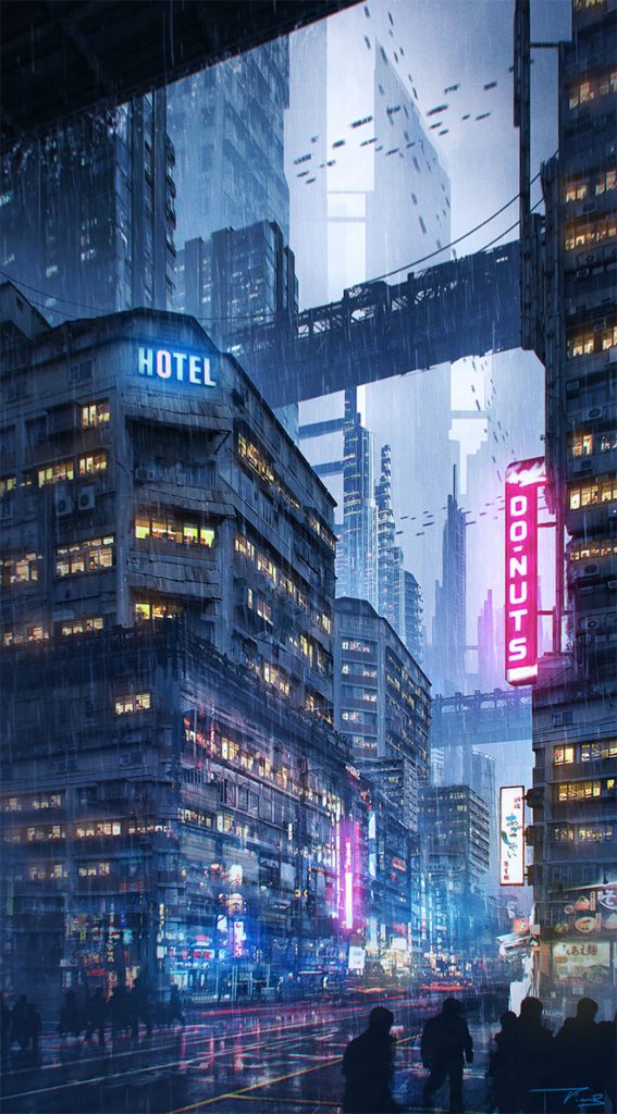
What captivates me about this artwork is the arrangement of the scene; the scene has a clear background, middle ground, and foreground, as underlined by the tonal values; the artist also plays with the leading lines of the bridge as it helps navigate our eyes to the building on the left, which is the main focal point. In addition, the artist used text and neon lighting to direct our attention to the signs that provide further information about what is going on in the picture also adding to the narrative of the scene. In addition to making the scene feel more lively, the image contains a large number of diagonal lines, which help to generate depth inside the image, resulting in an interesting composition. The artist used a variety of techniques to create a dynamic atmosphere in the image, including double exposure on the road and the distortion of the flying vehicle in the sky, which contribute to the narrative of a fast-paced, lively setting.
Because there are so many intricacies in the image, the artist kept the main buildings in the same muted colour. To avoid overwhelming the viewers with the already stimulating scene. This piece of art inspires me to consider how I may use the foreground and background to create pacing in the way viewers move through my scene. The narrative of a scene is determined not just by what is in it, but also by how you portray the image and where you direct your viewers’ attention initially.
Primary Source – Barbican, Battersea PowerStation & Other Brutalist Architecture Photos
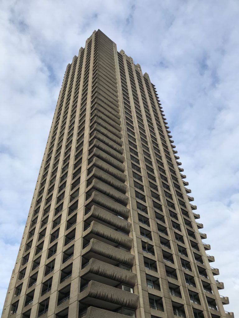
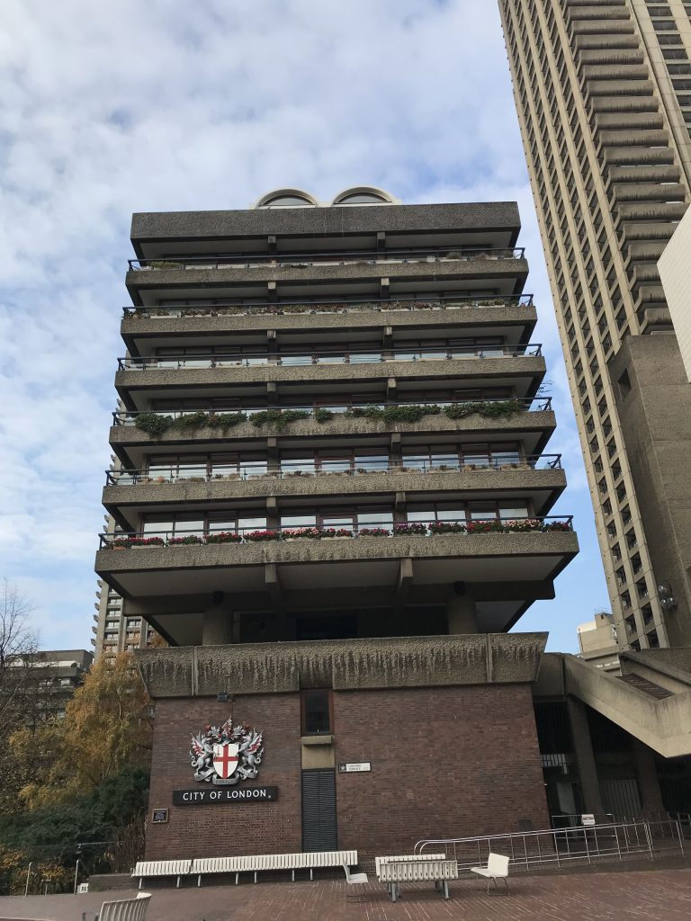
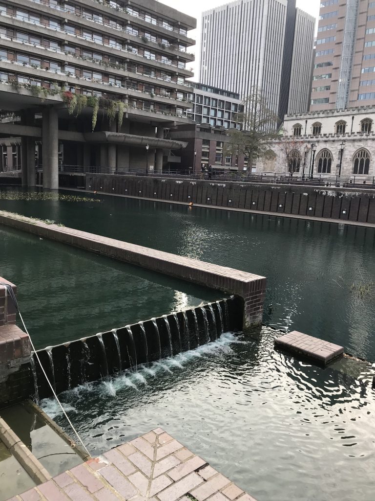
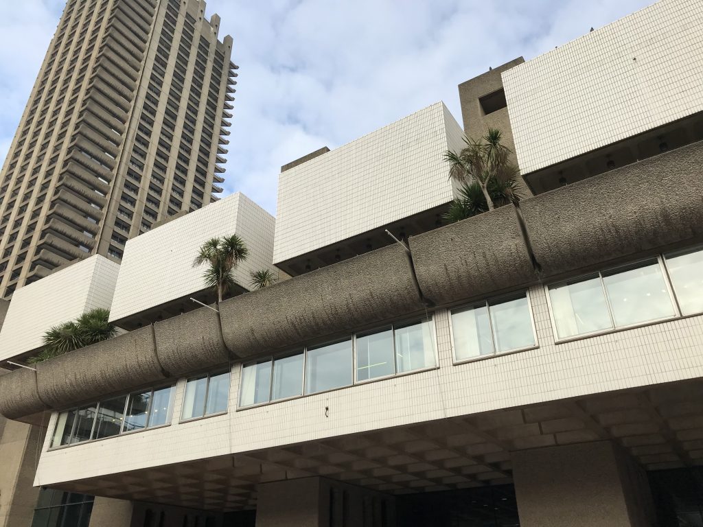
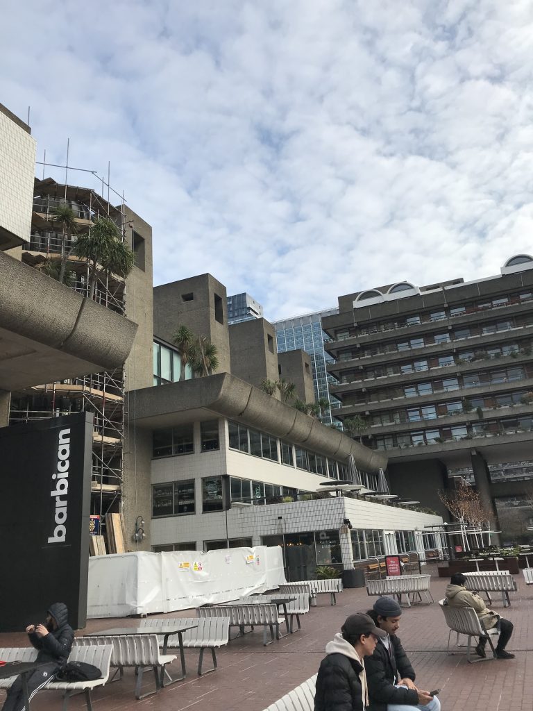
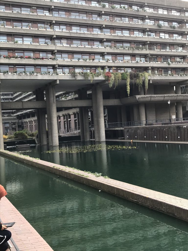
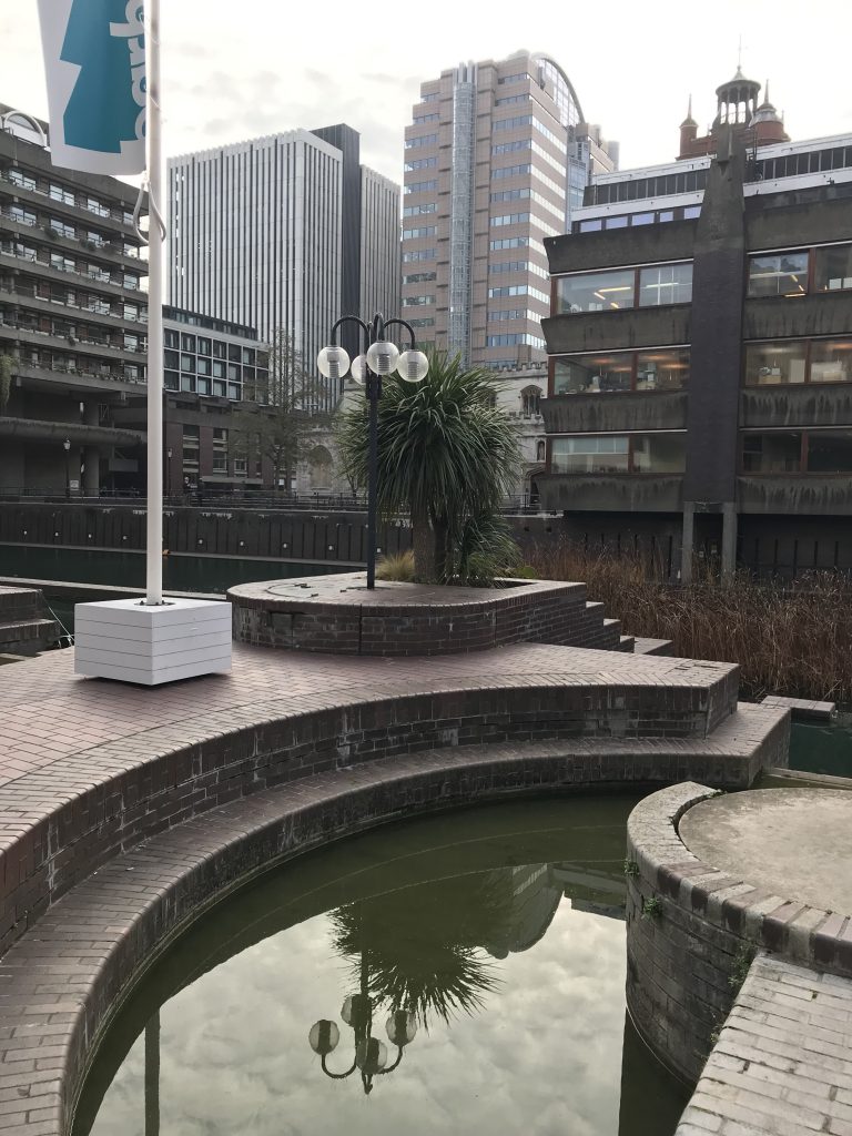
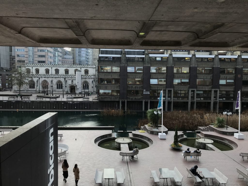
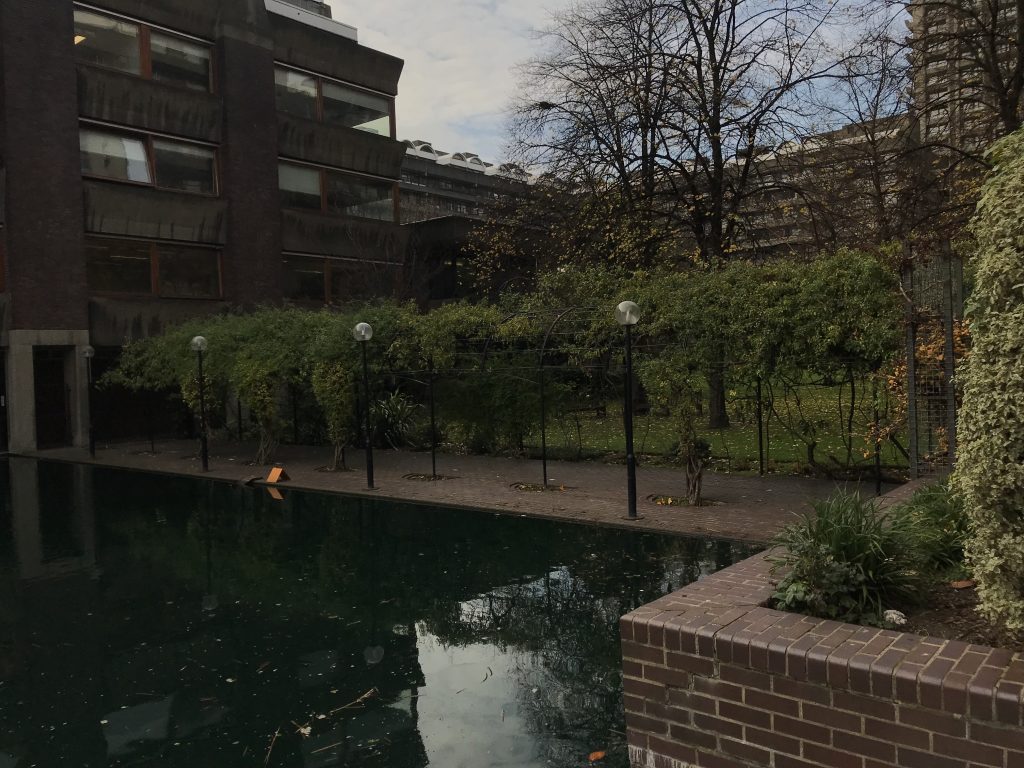
I went around London looking for Brutalist architecture to help inspire my concept. I first visited the Barbican because the structures combine nature and brutalism, which is a very post-apocalyptic concept. It’s fascinating to see how these opposing elements combine to create a beautiful area that also houses a community, defying the preconception of brutalist architecture as ugly and a form of separation and power. I was inspired by the symmetrical features of the building and how the buildings aren’t in just one colour but a variety of shades which makes the building interesting. Although the building lacks colour, it compensates for it in the various forms of shapes, as the buildings aren’t just rectangles and squares. The architecture also features more curved shapes, making the buildings appear less intimidating.
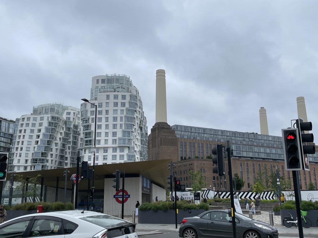
Another popular Brutalist architecture that piqued my interest was the Battersea PowerStation, which, despite its industrial and intimidating appearance from the outside, appears completely different inside, looking more elegant. The PowerStation has been updated to reflect modern consumer demands, but little has changed on the outside. The structure remains large in scale, and the colour scheme is more vibrant than the typical muted colour palette of general Brutalism architecture.
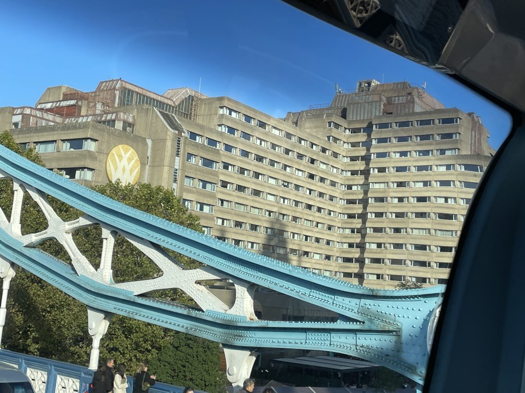
Finally, I photographed the Tower London Hotel because its Brutalist architecture in the heart of London and is a hotspot among tourists made it an interesting choice. As is customary, this type of architecture is regarded as ugly and dystopian, despite the fact that it serves as a vacation destination for visitors. This building appears depressing due to the monochromatic colour scheme, the raw material being the building’s main material type, and the building being a simplistic geometric shape with no creativity, all of which make the building appear unwelcome and cold.
These photos helped me visualise what kind of buildings I wanted to add to my scene and ways to make my buildings convey a vibe which I aim to play with throughout my project planning journey.
Compositions & Silhouettes in Movie
Blade Runner 2049
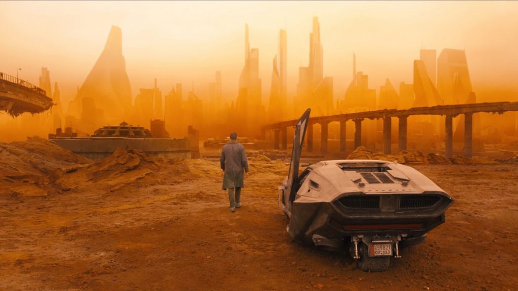
- The rule of thirds directs our attention to the bridge first, and the bridge serves as a leading line to draw our gaze into the city.
- The use of fog to separate the city in the background from the foreground elements adds mystery, as there is little detail surrounding the city because we only see its silhouette.
- Using a character in the Centre helps to visually illustrate the depth of the scene and makes the city look more tall and menacing.
- The use of the monochromatic colour palette and lighting of Orange adds to the scene as cities are usually depicted through a variety of neon colours and are shown to be bustling with life. On the other hand, the city in this image looks desolate. The overall atmosphere adds to the narrative that the city has been in ruins due to a catastrophe.
- The use of smog makes the scene not only look nightmarish as the atmosphere is almost concealed adding to the mystery but it also makes the scene look suffocating due to the smog being thick.
Inception
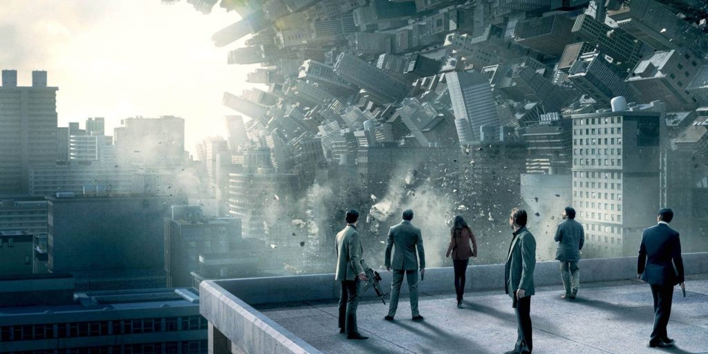
- The golden spiral used in this shot draws our attention to the scene and creates appealing imagery because the golden spiral is commonly used in more natural-looking images, but this image is a complete juxtaposition because the building curving in the scene is very unnatural, and the illustration of the buildings collapsing is far from beautiful.
- The use of a cold monochromatic blue colour palette adds to the dystopian element of the imagery as the colour blue usually connotates to negative depictions of isolation and depression.
- The fact that the characters are all on the right creates the rule of thirds in this image because we are drawn to them and follow their gaze on the horizon to guide our own eyes across the landscape.
- Unlike the previous image the background of the scene is more detailed than the foreground and thus makes the scene look more overwhelming to the eye.
- Using characters also help to create a sense of depth making the scene look more big and overwhelming. In addition, by making the city look like a big wave its adds to the dynamic nature of the scene.
By studying Movie scenes and analysing how movies set the scene with camera angles, compositional techniques, characters, lighting and colour schemes we can learn how to be able to immerse the viewers into our game scenes to add to the narrative that we want to convey. As being an image with no storytelling narrative to it we must try to make the viewers understand what we are trying to illustrate by guiding them on a nonverbal tour of our environment. I want to be able to take away from my studies and apply such techniques to my own scene to create a visual immersion of the environment for the viewers to see.
Peer Tests (Playing with Photoshop)
Khadija -> Rui
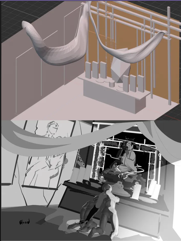
How I manipulated their work on photoshop:
- Gradient Map tool – Change the colour scheme of their work to add a more ethereal yet mysterious atmosphere to the shrine.
- Quick Selection Tool – To select only the background to change its colour
- Lasso Tool – Made irregular shapes to create leaves which surrounded the background
- Brush tool – To add the ghostly characters to make the scene look more lively and add glowing lights to the scene to create a sense of warmth in the atmosphere
- Colour picker tool – to help me find the correct shades of colour to make the scene look more cohesive
- Brightness & Saturation – To play with the colour schemes to make the scene look more vivid and bright.
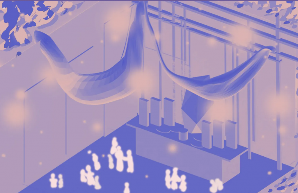
Khadija -> Ash (Allie)
How I manipulated their work on photoshop:
- Layers function – Colour burn (made things more red), Darken (made the colour twice as dark), Colour Dodge (Made things white)
- Transform tool (flip horizontally/vertically) – Used it to change up the rotation of the image to play with textures in the scene and background.
- Opacity – played with opacity to make layers intersect and add interesting layers.
- Object Selection tool – to quickly select objects in the photo e.g. flower , stairs.
- Transform tool (scale) – enlarge the flower in the back to create depth.
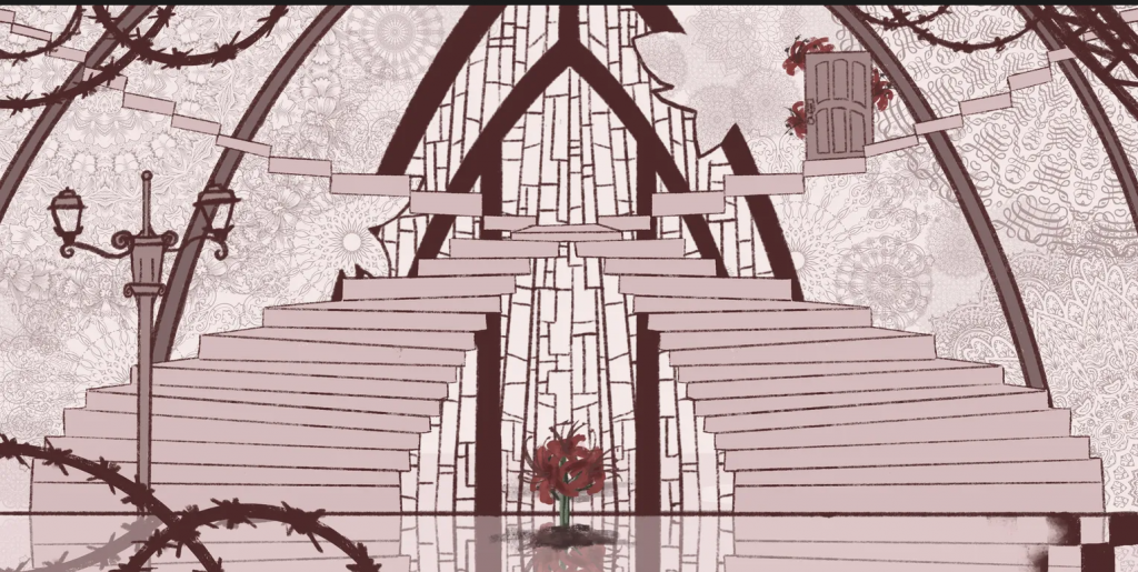
Khadija -> Yu
How I manipulated their work on photoshop:
- Hue/Desaturation tool – used to desature the colour to make the image look cohesive
- Filter tool (underpainting filter) – to layer onto of the image with a smooth edges.
- Fill colour tool – to make the background a slight tint, by using the background image as a place to collect my colours from.
- Magic tool selection – helped me select the gradient like background.
Before bringing my scenes into Photoshop, we had to manipulate and adapt our classmates’ 1K images, which were primarily their plans for their final pieces. We were encouraged to experiment with the Photoshop tools to become acquainted with the manipulation techniques in Photoshop, which can not only help to speed up the rendering of our final pieces but also provide more ideas to our peers while we were still in the process of adapting our drafts for our final scenes.
This task was very useful in the process of idea generation because it made me think about how I can change the atmosphere of an artwork with a few minor adjustments. Furthermore, looking at my peers’ work and how they have composed their artworks to make their scenes look more dynamic has helped me think about how I can improve my own scenes. I aim to use some of these techniques in my rendering process as I want to be able to make my scene look more interesting yet still cohesive.
Discussing Plan Ideas
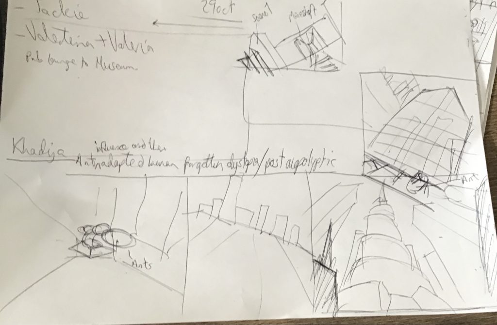
Before beginning to draw the compositions for my scenes, I went to my teacher for advice. We talked about how to make my scenes appear more connected, as the first drafts I showed him confused him about which scenes were from the same environment. He suggested that I have sections of the other scenes interact with each other, such as an ant trophy on a bookcase linking back to the large sculpture in the town centre. In addition, He advised me to consider how I could use composition to help viewers navigate the scene, which appeared overwhelming and disorganised. Finally, he advised me to be clear about which theme I was referring to, as I was referring to two themes: the post-apocalyptic side of my project, in which the place is in ruins after a major event left the entire place in disarray, and the forgotten dystopia, in which the inhabitants’ social structure drove their citizens to make the environment look the way it does.
This discussion helped to develop my ideas shifting my focus from just adding assets to make the scene look overwhelming to creating a composition that not only visually expresses the narrative that I want to convey but also ways that it can tie back to the overall themes.
Extra – Block out (scene 2)
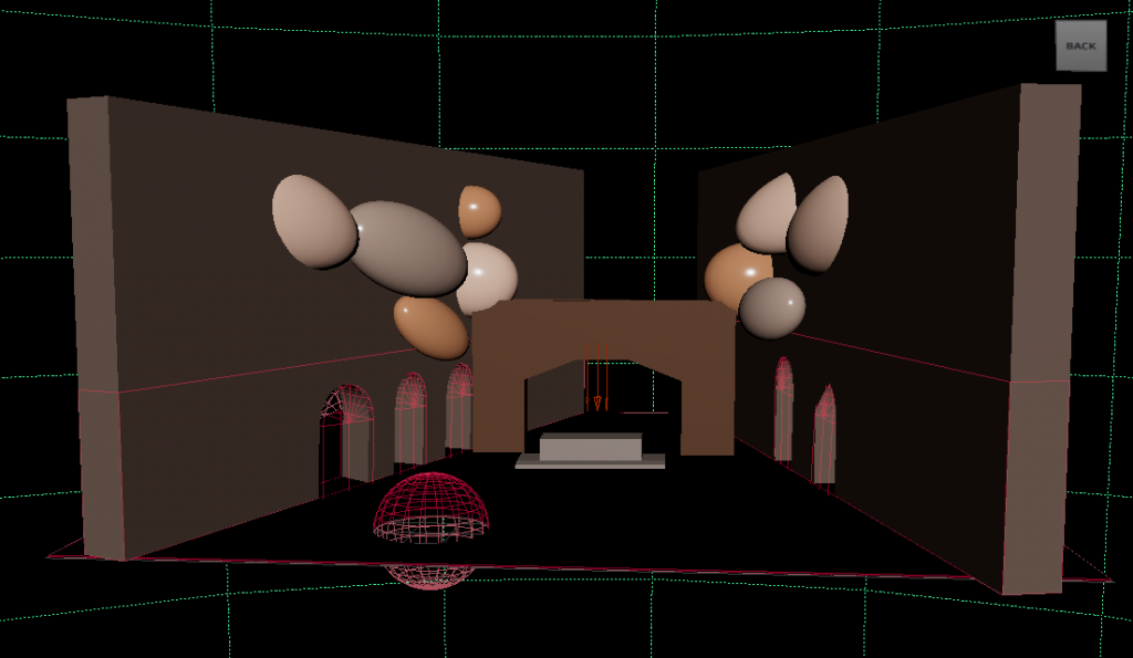
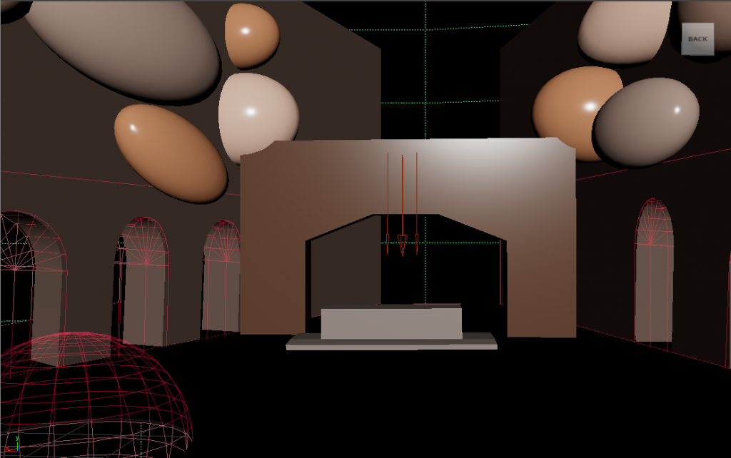
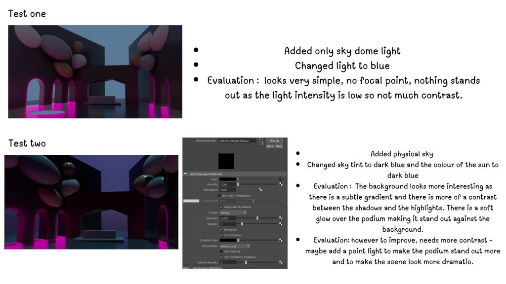
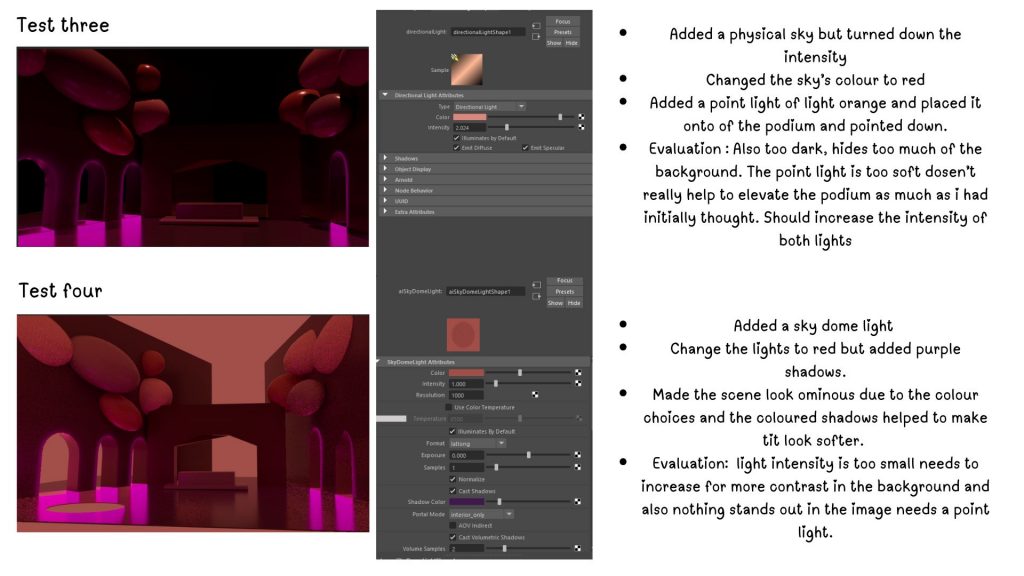
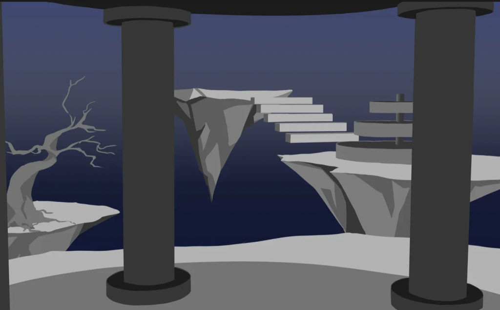
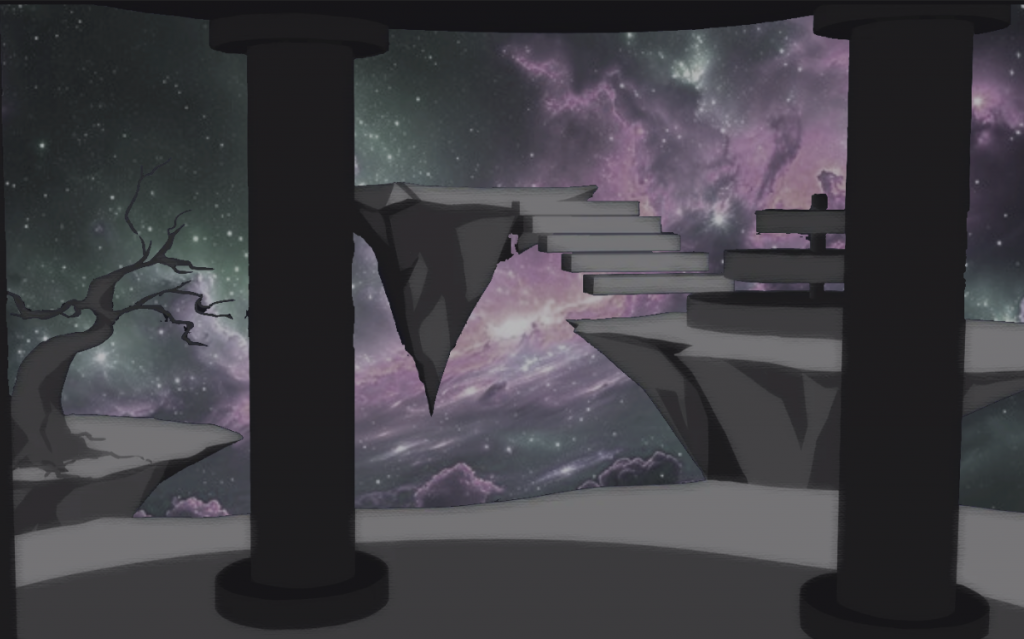
I tried another 3D lowpoly mock up of one of my scenes, this time I’ve attempted the second scene. I created some of the basic shapes of the scene by using the poly modelling, extrude and beveling too to keep the modelling simple. I then played with the lighting, I struggled with trying to make the lights appear exactly how I have wanted it too look like but despite the problems I managed to create a few iterations of lighting and colour for the scene.
It allowed me to visually see where the shadows and highlights would be on the building and environment, and while it did not become a lighting source that I ended up using, it did help me see how I could make the scene look more dramatic when I rendered the 2D images. To improve on these experiments, I hope to learn how to use more dramatic lighting in future projects and experiment with harsher lighting techniques.
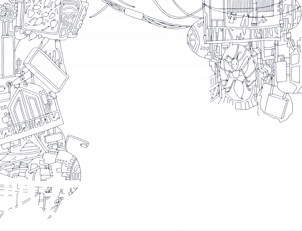
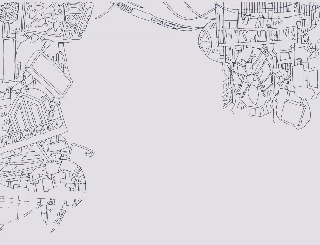
Extra – Line art process + problems I’ve faced
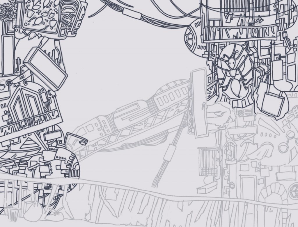
During the process of drawing the line from the draft of my art piece, I ran into a few issues. The first was that my line art appeared to be too thick, although my digital brush (Dip pen tool) could not go any lower than 0.3mm in width. I spoke with my teacher, who advised me to find a way to make the line art look thinner because it would make the image appear more polished. We discovered that my resolution was too low, 700×500, and I needed to increase the DPI to 4k resolution as specified in the brief. After increasing the resolution, I realised the lines were still too thick, but there was no way to slim them down on the app in a more efficient manner because the only way to make them thinner was to redraw them. However, I decided to import the image from the drawing app that I had originally used into Photoshop. Still, before I could transfer the image, I needed to make it transparent, so I outlined the image with the quick selection tool and then cut out the background. Finally, I saved the image as a PNG and imported it into Photoshop.
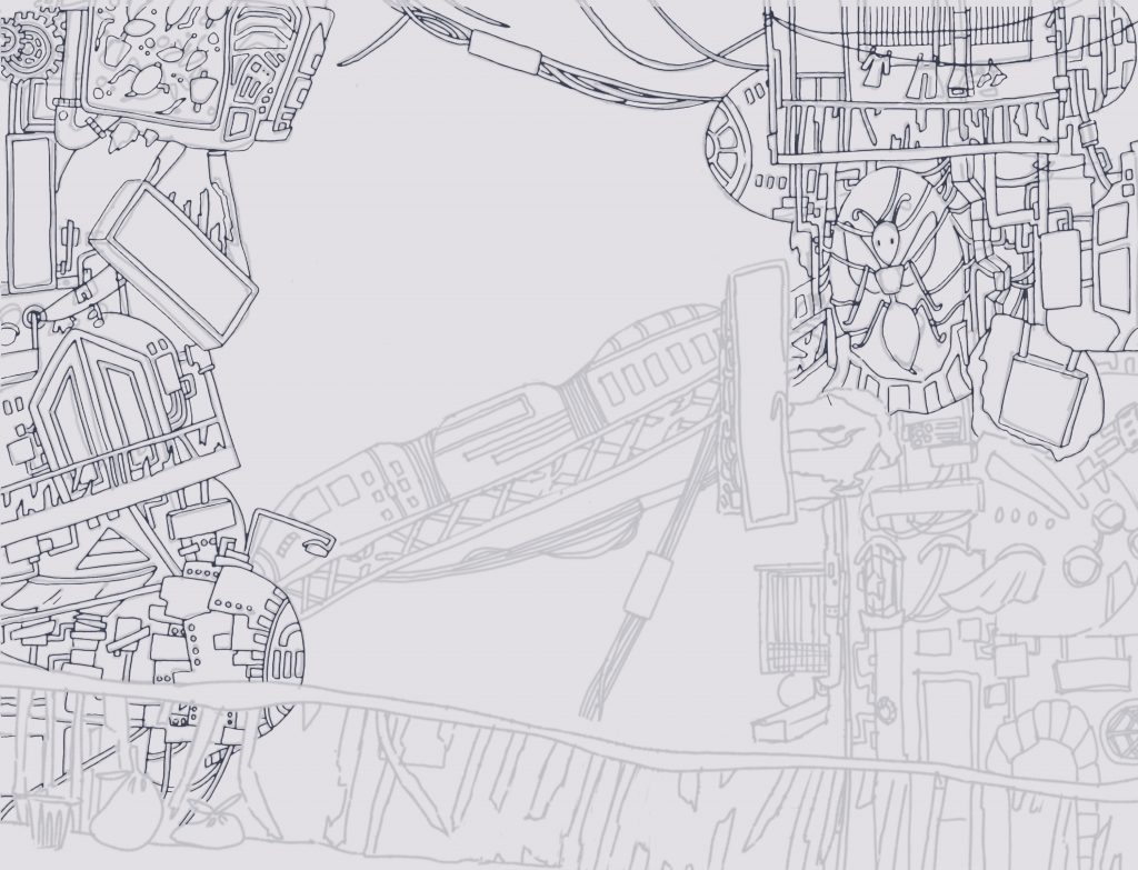
After uploading the image to Photoshop, I used the quick selection tool to select the lines, followed by the feather tool to soften the edges of the lines and cut them back to make them appear thinner. Although it did the job, I was dissatisfied with the outcome because it first made the lines appear uneven due to the feather tool’s inaccuracy, particularly around corners; second, the lineart did not line up with the original design; and third, the lineart appeared too thin, so when I drew more lines, the effect was not the same as the feathered line art, so I scrapped this lineart and restarted.
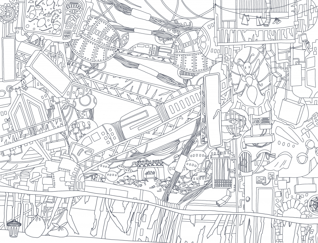
I ended up playing with width sizes on a more minuscule level (I’ve used 0.5mm for the section of the scene closest to the camera angle and 0.4mm for the rest) to add a little more depth to the scene by making the foreground look closer to the camera. I also added more details to the overall scene and added a background to add more depth of field to the image and to add to the environment by making it not look like it’s in the sky. I liked the line art better as the thinner lines gave me more space to substitute more detail to each part of the scene which added to the overall effect of an overwhelmingly densely packed environment which I aimed to portray.
Although it did not work out, I learnt a few new techniques that will be useful for future projects, and by scrapping this one, I will be able to improve my lineart even more by experimenting with width sizes and adding finer details to make the image look more polished.
Other Game IPs Influence in my project.
IBIS Layering (Render Process – Detailed)
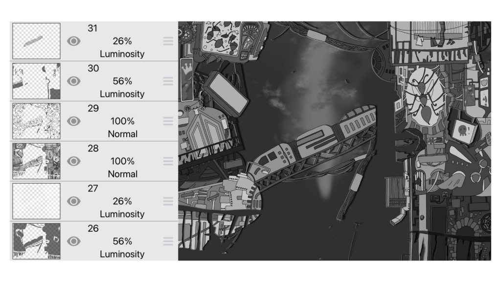
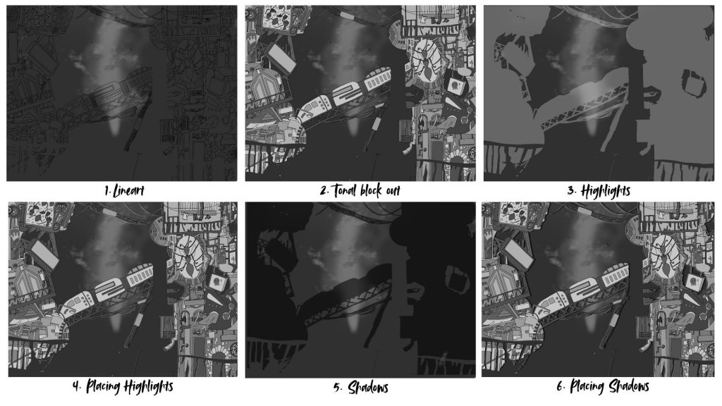
- Lineart – I drew over my sketch, using the Dip Pen tool. This part of the process was simple despite the amount of details due to me tracing over my original work but only fixing up miniscule details to refine the lineart.
- Tonal block out – I blocked out the tonal values of the scene using the paint bucket tool. This part of the process was the most tedious as I had to take in all the details into consideration when figuring out where to place my dark and lighter values. I didn’t want any details to blend in with each other, so I used 8 different tonal values to block out and distinguish the assets in my scene.
- Highlights – I duplicated the lineart and tonal block out and merged them together and used Filters: “Black and white” to turn the layer into a white silhouette and used “Gaussian Blur” to blur out the edges to give a soften look to my highlights. I played with the opacity of the layer and the layer types to figure out ways I would like my highlights to look in the scene. I ended up picking the luminosity layer as it made the highlights look translucent which made it blend within the scene better.
- Placing Highlights – I used the move tool to shift the highlights south west to make it appear behind the building. This took trial and error to get the look correct. I used this method to make the process of rendering easier as due to the complexity of my scene and limited time frame I didn’t have enough time to individually draw out the highlights.
- Shadows – Similar process to the Highlights but turned the layer into a black layer instead. The luminosity for my shadows were a little less stronger than my highlights as I wanted my shadows to be strong, in addition for each layer behind this section of the scene I made the shadows and highlights get lighter to blend into the scene better. On the other hand the shadows and highlights before this section got darker.
- Placing Shadows – I used the move tool to shift the the shadows right to appear behind the scene, I made the shadow lines thicker than the highlights.
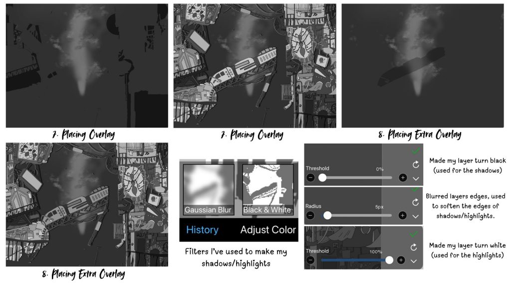
- (7.) Placing Overlays – I duplicated the lineart and tonal block out and merged them together and used Filters: “Black and white” to turn the layer into a black silhouette and lowered down the opacity to create a dark overlay on top of areas of the scene that I thought would be behind as due to the complexity of the scene I found it difficult to separate it into different layers.
- (8.) Placing Extra Overlays – Similar to the process above.
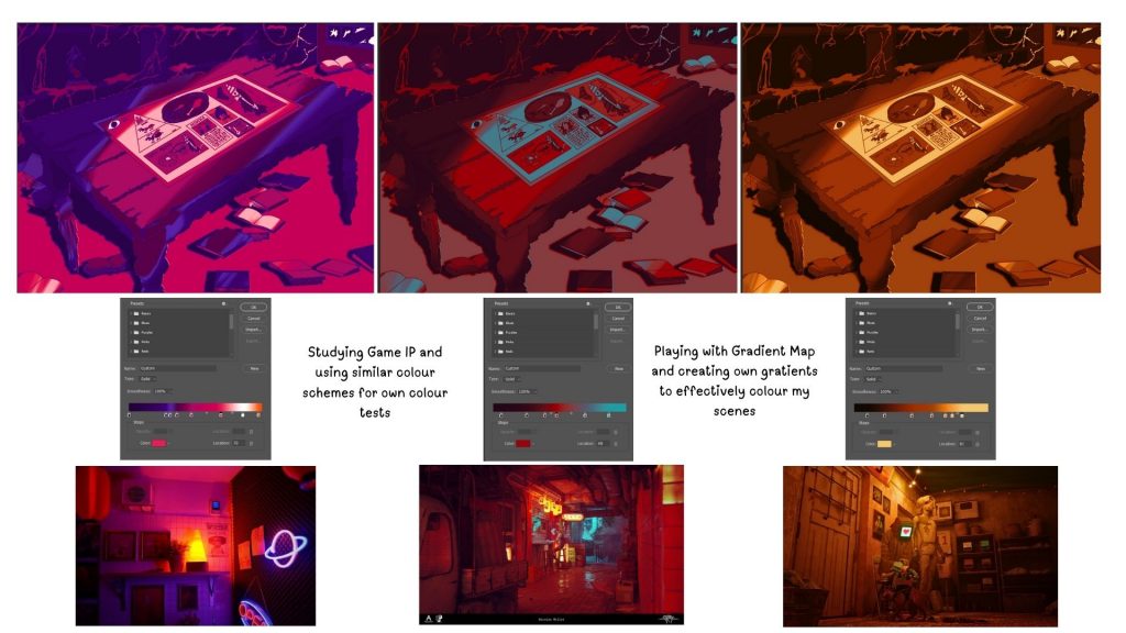
Colour Tests (Game IP study)
To further explore and reference my Game IP, as well as incorporate it into my project, I’ve decided to examine how Stray has used a variety of colours to bring their scenes alive. I was initially inspired to include this game in my project because of how colour and lighting were used to tell a story about a living space. Because this game is based on the stories of people who once lived in these abandoned spaces, it does an excellent job of setting the scene for a place that has either been a warm and lively environment or an unsettling space of ruins left over time.
Since I already had the tonal values of my scenes planned out, I decided to take advantage of the Photoshops Gradient tool to help in my colouring process to colour my pieces quickly and efficiently. I referenced actual images from Stray that depicted unique colours and lighting and applied the same colour schemes to my scenes to see how they changed the overall atmosphere.
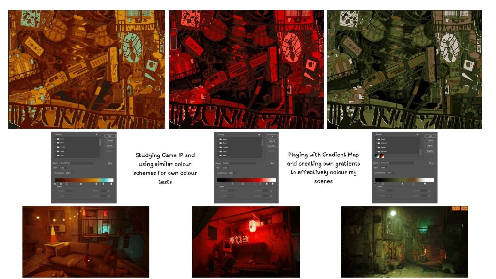
- In the first image, I played with a complimentary colour scheme that leaned more onto the warmer orange side. I make the scene look unique due to how bright it looks, the orange makes the scene look polluted and overwhelming due to the scene looking similar in tonal values. The blue makes certain parts of the image stand out creating several focal points. I didn’t really like how there was little contrast overall and the random blue made some of the elements look out of place.
- The second image appeared more cohesive due to its monochromatic colour scheme. I liked the red colour scheme because it made the scene appear ominous, which is what I wanted to convey, but I disliked how strong the red was in this scene; it was too overpowering. In addition, I wanted to experiment with different colours in my scene to make it more interesting.
- The third image has a more earthy colour scheme which not only was synonymous with the scenery of it being an ant colony but also added a sense of mystery to the scene due to the cold colour palette creating an ominous aura mixed with the colours being similar in tones making the scene look dark and mysterious. If i were to improve on this I would add more lighter/darker colours to create a bigger contrast in tonal values.
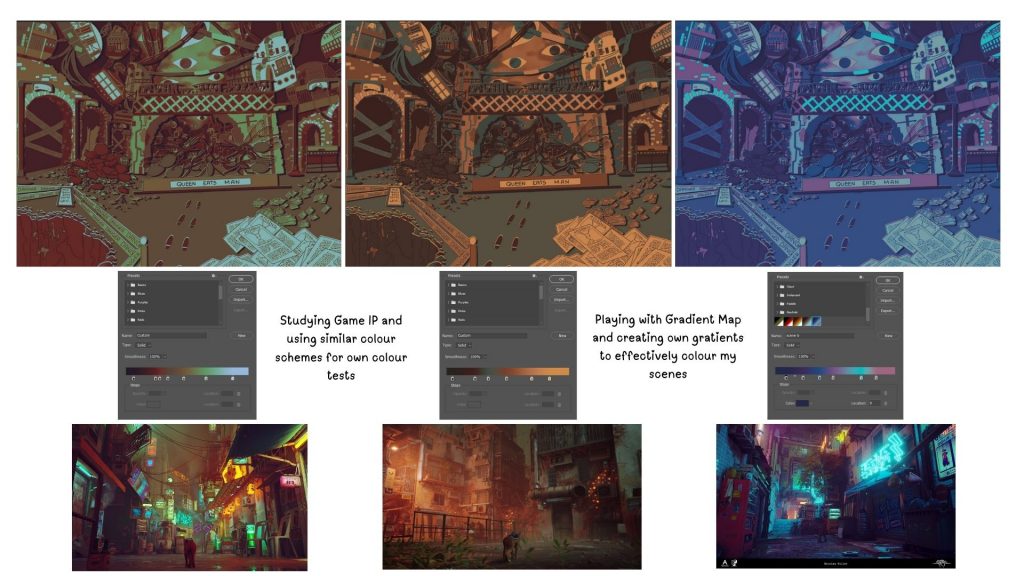
- The first image had more contrasting tones due to the difference in red and blue tones making the scene look more clearer. However, the blue and red makes the scene look muddy and dull leading to the lack of vibrancy.
- The second image had better contrast and the blue and orange complimented each other creating almost a rusty polluted, antique environment which i really liked. The only problem is that it needed a more lighter highlight to make some areas of the scene stand out.
- The third scene looks kind of futuristic due to the cold colour palette and neon blue choice, it adds to the futuristic element of the scene. However, I didn’t like this as it was too bright and less sinister due to the vivid colour choices.
- The first scene looks retro futuristic due to the bold neon colour choices, it adds to the futuristic elements of the scene but it looks to bright and warm to add a sinister aura to the environment.
- The second image looks more ominous due to using red as the main colour scheme of the image however the blue accents washes out the image, making it less intimidating. I would consider exploring other colour choices that could make the scene look better.
- The third scene uses a monochromatic colour scheme of orange with highlights of yellow, it makes the scene look almost nostalgic. I liked this image the most out of the others but to improve it I would consider adding a different lighting choice to make the scene look more ominous.
By exploring my Game IP’s colour schemes and using them on my own scene I can assess how lighting can affect the atmosphere I want to portray. It helped me to discover how I can play with colours and tones to make my scenes stand out. I found this experimentation useful as it brought me closer to visions for each scene and how I want my scenes to be portrayed.
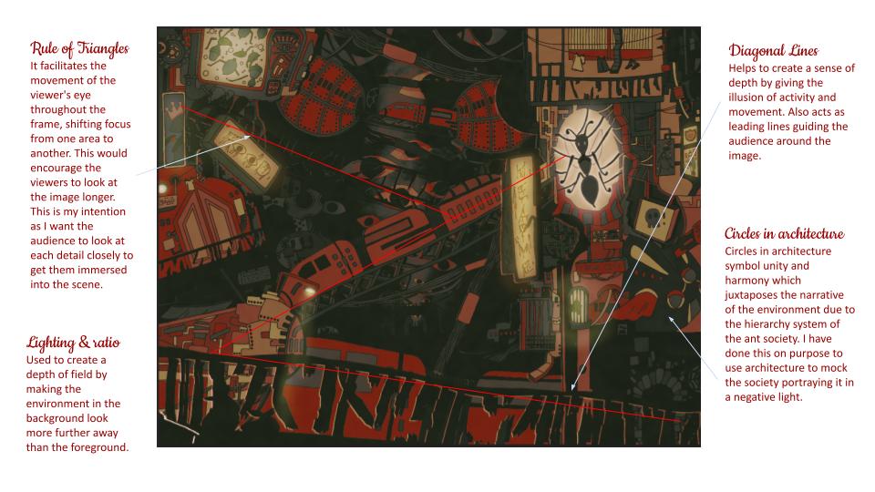
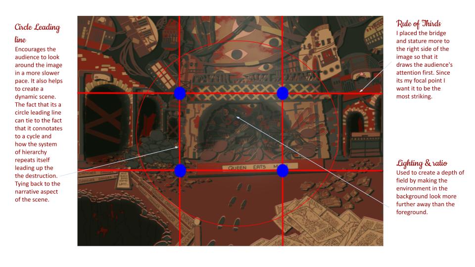
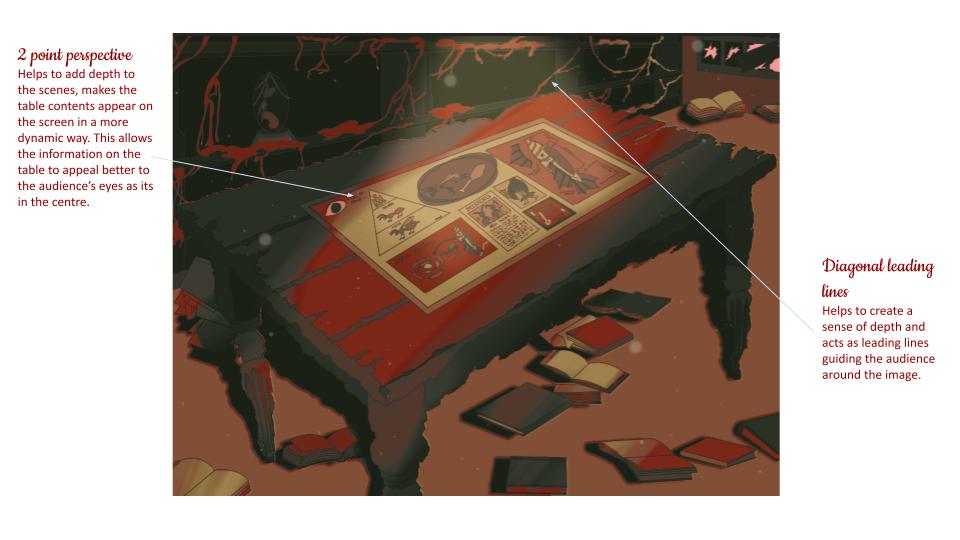
Composition Analysis
Animating the scenes (After Effects) – Bigger images, if you can see on the powerpoint.
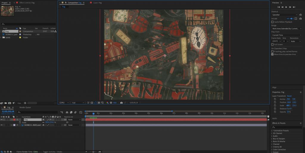
For my first scene, I created an atmospheric fog using after effects. To create this effect I went to Solid < Effects & Pre-sets < Fractural Noise. I created a stopwatch for the fog and made it move to the right to make it seem as if the fog is moving using the offset turbulence setting. Lastly, I increased the width and size of the fog so It distorted the fog shape and covered the whole scene and then turned down the opacity so that It blended with the scene.
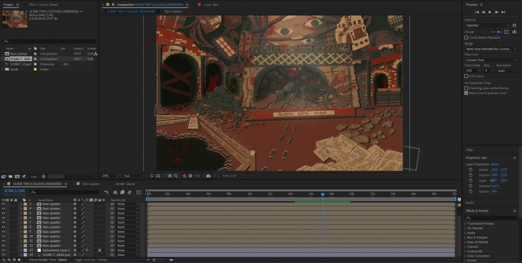
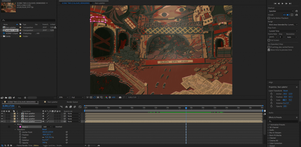
For my second scene I wanted to have rain but to adapt on the rain, I’ve decided to include rain splatters to make the effect look more interesting. To create this I went to Adjustment Layers < Effects & Pre-sets < Simulation < CC Rainfall I played with the direction of the rain and the density to create a rainfall that’s a bit different from the rainfall pre-set. To create the rain splatters I used Solid < Effects & Pre-sets < CC Particle Systems II, but I played with the gravity settings, birth rate, longevity, velocity and a few other settings to make the rain splattering effect. I then used the Anchor point to move the effects to surface areas in my scene in which I thought the rain would hit to create this effect and used a mask pen tool to clean up the edges so that the rain splatter was around the object. I duplicated the rain splattering effect and placed it around the scene to other objects that the rain would hit to create a splatter to make the scene look more cohesive.
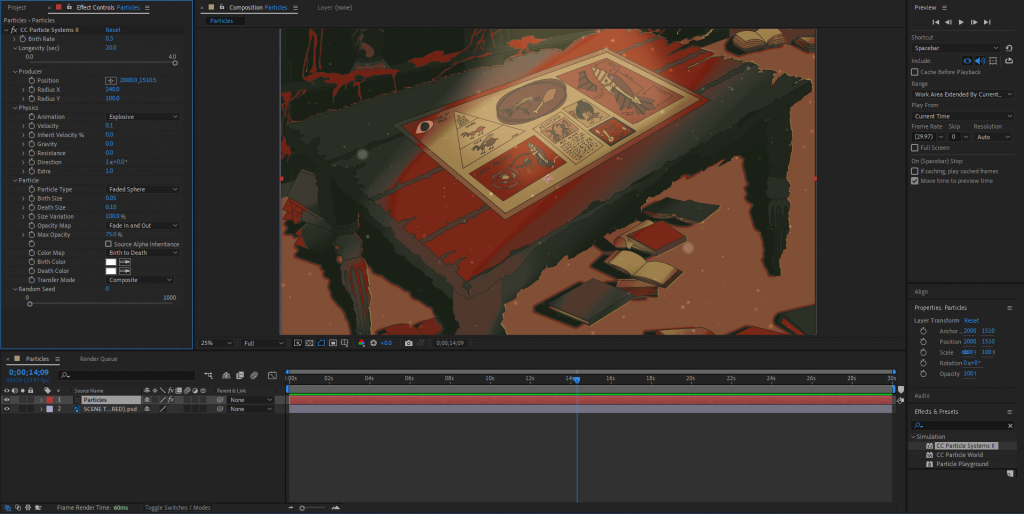
For my third scene I wanted to create some dust particles to show that this room is old and dusty. To create this effect I went to Solid < Effects & Pre-sets < CC Particle Systems II which created a firework-like spark. However, I wanted this to turn into floating particles not sparks, so I played with a few settings and turned the sparks into faded spheres which moved in a more random direction creating the effect that I had envisioned. Lastly, to make it blend with the scene I turned the layer into an overlay layer to make the particles look less bright.
Using After effects made animating simple as opposed to hand drawing the animations as I was able to create atmospheric scenes using simple tricks than having to draw everything for each frame. However, If I were to develop upon this, I would find a way to merge hand drawing animations with digital software’s to create animations that still sticks to the art style but is more quick and efficient to make.
Bibliography
- It Takes Two – Environments, Olle Norling (2024) ArtStation. Available at: https://www.artstation.com/artwork/zOwW24 (Accessed: 3 October 2024).
- Sky: Children of the Light, Aoi Ogata (2024) ArtStation. Available at: https://www.artstation.com/artwork/2xDlmA (Accessed: 3 October 2024).
- Howl’s Moving Castle (no date) Screen Slate. Available at: https://www.screenslate.com/articles/howls-moving-castle (Accessed: 3 October 2024).
- Stray (Game) Wallpapers (29 images) – WallpaperCat (2022) Wallpapercat.com. Available at: https://wallpapercat.com/stray-game-wallpapers (Accessed: 3 October 2024).
- Erskine, D. (2021) Little Nightmares 2 review: Terror in the big city, Shacknews. Available at: https://www.shacknews.com/article/122653/little-nightmares-2-review-terror-in-the-big-city (Accessed: 3 October 2024).
- SalisburyJohnof (2022) The Architecture of Elden Ring. Available at: https://www.reddit.com/r/Eldenring/comments/wzz9mi/the_architecture_of_elden_ring/ (Accessed: 3 October 2024).
- Cyprezz LLC (2015) The Real Hogwarts (download) Minecraft Map, Planet Minecraft. Available at: https://www.planetminecraft.com/project/hogwarts-2883086/ (Accessed: 3 October 2024).
- Asteroid Hd Transparent HQ PNG Download | FreePNGImg (2017) FreePNGImg. Available at: https://freepngimg.com/png/33550-asteroid-hd (Accessed: 3 October 2024).
- Showcase of Mind Blowing Concept Art of Futuristic Cities (2016) Spoon Graphics. Available at: https://blog.spoongraphics.co.uk/articles/showcase-mind-blowing-concept-art-futuristic-cities. (Accessed: 3 October 2024).
- RED D12 (2022) STRAY – MOST BEAUTIFUL ENVIRONMENTS & Photorealistic Reshade 4K, YouTube. Available at: https://www.youtube.com/watch?v=9hSWhLITw-w (Accessed: 27 October 2024).
- MLC Studio (2022) Delving into the art style behind stray, Artstation.com. Artstation. Available at: https://www.artstation.com/blogs/magnaludumcreatives/vldP/delving-into-the-art-style-behind-stray (Accessed: 27 December 2024).
- Wondergirl (2022) [Guide] Stray : Full walkthrough – GameActuality.com, GameActuality.com. Available at: https://www.gameactuality.com/guide-stray-full-walkthrough/ (Accessed: 27 December 2024).
- Reddit – Dive into anything (2022) Reddit.com. Available at: https://www.reddit.com/r/stray/comments/w64noo/the_game_environment_is_seriously_beautiful/?rdt=55234 (Accessed: 27 December 2024).
- Wen, A. (2022) Stray review: cyberpunk with heart, Stuff. Available at: https://www.stuff.tv/review/stray-review/. (Accessed: 27 December 2024).
- McKenzie, T. (2022) Art Dump: A Behind-The-Scenes Look at Stray, 80.lv. Available at: https://80.lv/articles/art-dump-a-behind-the-scenes-look-at-stray/. (Accessed: 27 December 2024).
- Reddit – Dive into anything (2022) Reddit.com. Available at: https://www.reddit.com/r/stray/comments/y75vjg/i_loved_the_worlddesign_of_stray_so_i_recreated/ (Accessed: 27 December 2024).
- McKenzie, T. (2022) Art Dump: A Behind-The-Scenes Look at Stray, 80.lv. Available at: https://80.lv/articles/art-dump-a-behind-the-scenes-look-at-stray/.(Accessed: 27 December 2024).
- MLC Studio (2022) Delving into the art style behind stray, Artstation.com. Artstation. Available at: https://www.artstation.com/blogs/magnaludumcreatives/vldP/delving-into-the-art-style-behind-stray.(Accessed: 27 December 2024).
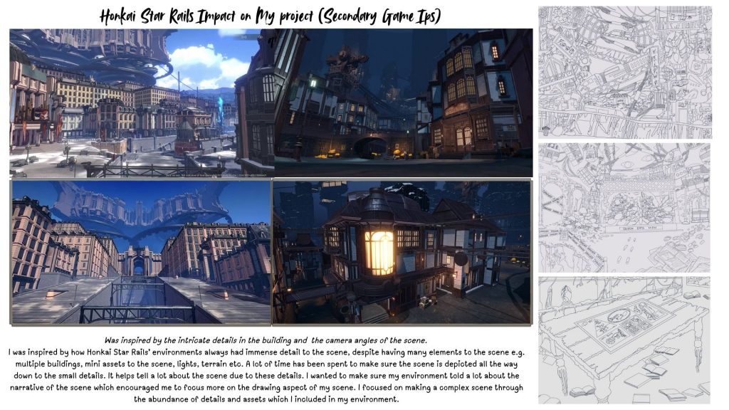
- Rail, S. (2024) Gathering Place, Honkai: Star Rail Wiki. Fandom, Inc. Available at: https://honkai-star-rail.fandom.com/wiki/Gathering_Place (Accessed: 27 December 2024).
- Rail, S. (2024) Administrative District, Honkai: Star Rail Wiki. Fandom, Inc. Available at: https://honkai-star-rail.fandom.com/wiki/Administrative_District (Accessed: 27 December 2024).
- HoYoLAB – Official Community (2024) Hoyolab.com. Available at: https://www.hoyolab.com/article/4452616 (Accessed: 27 December 2024).
- Si, N. (2023) All Boulder Town Treasure Chest Locations in Honkai Star Rail, Pro Game Guides. Available at: https://progameguides.com/honkai-star-rail/honkai-star-rail-all-boulder-town-treasure-chest-locations/ (Accessed: 27 December 2024).
Leave a Reply